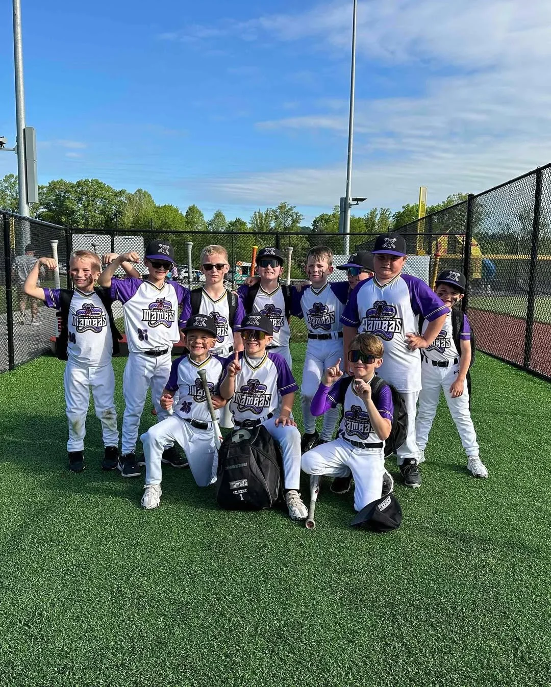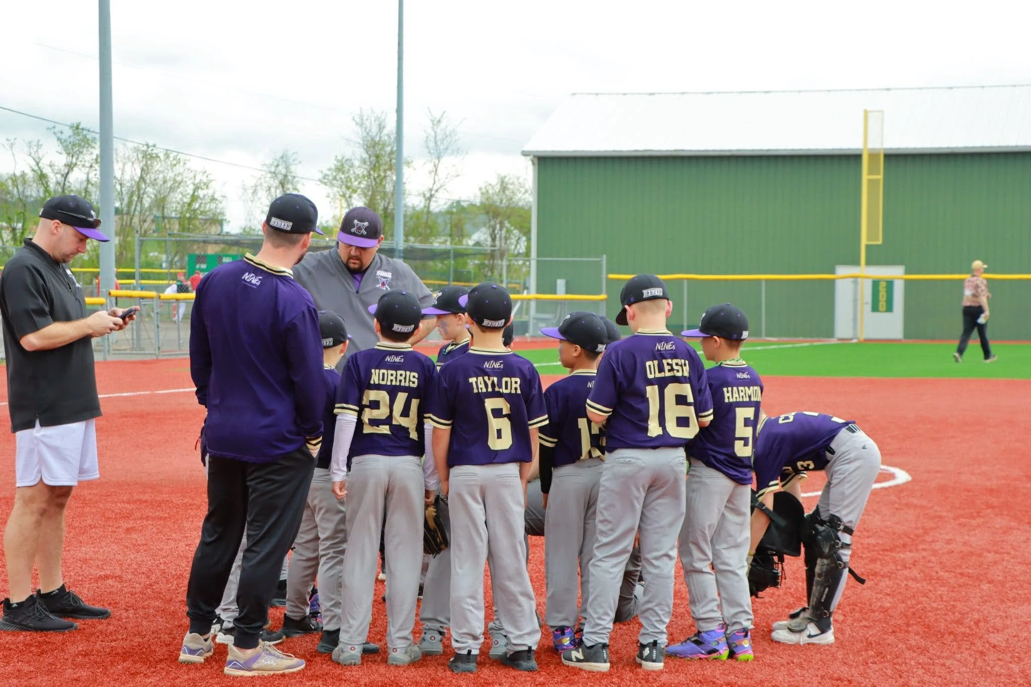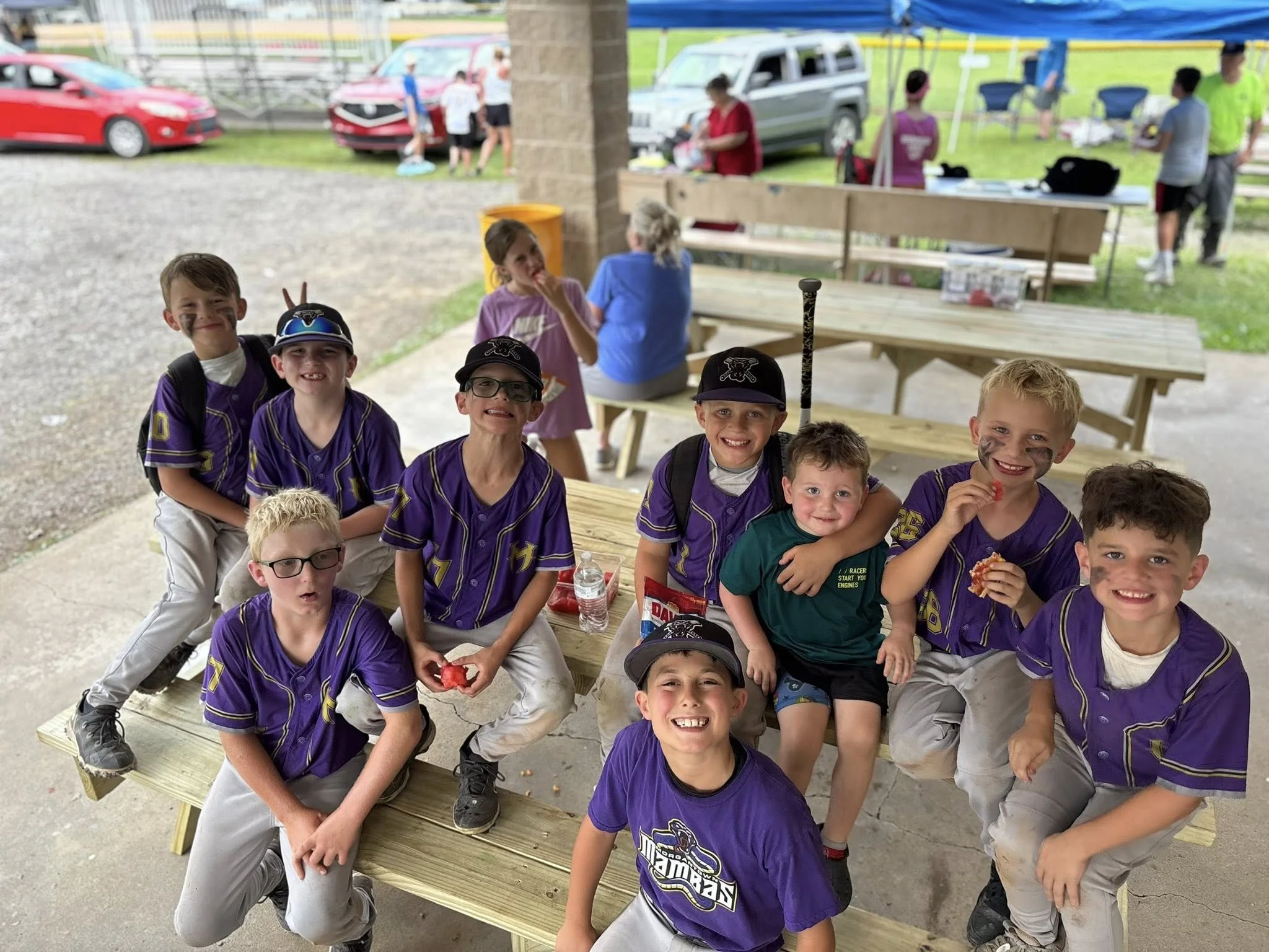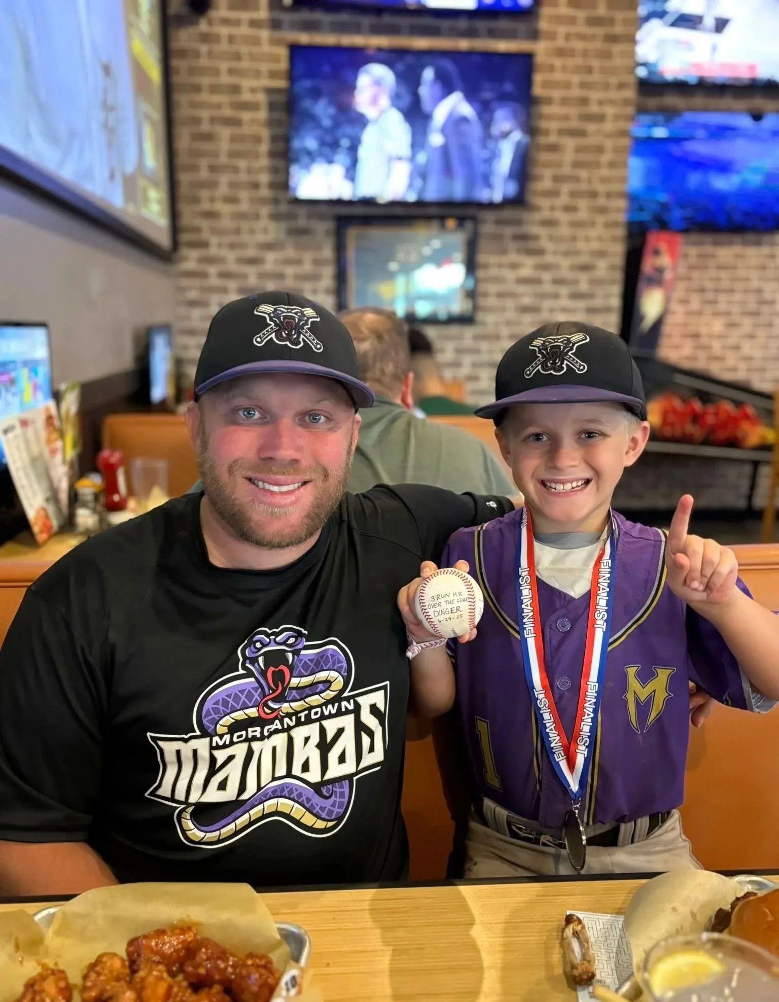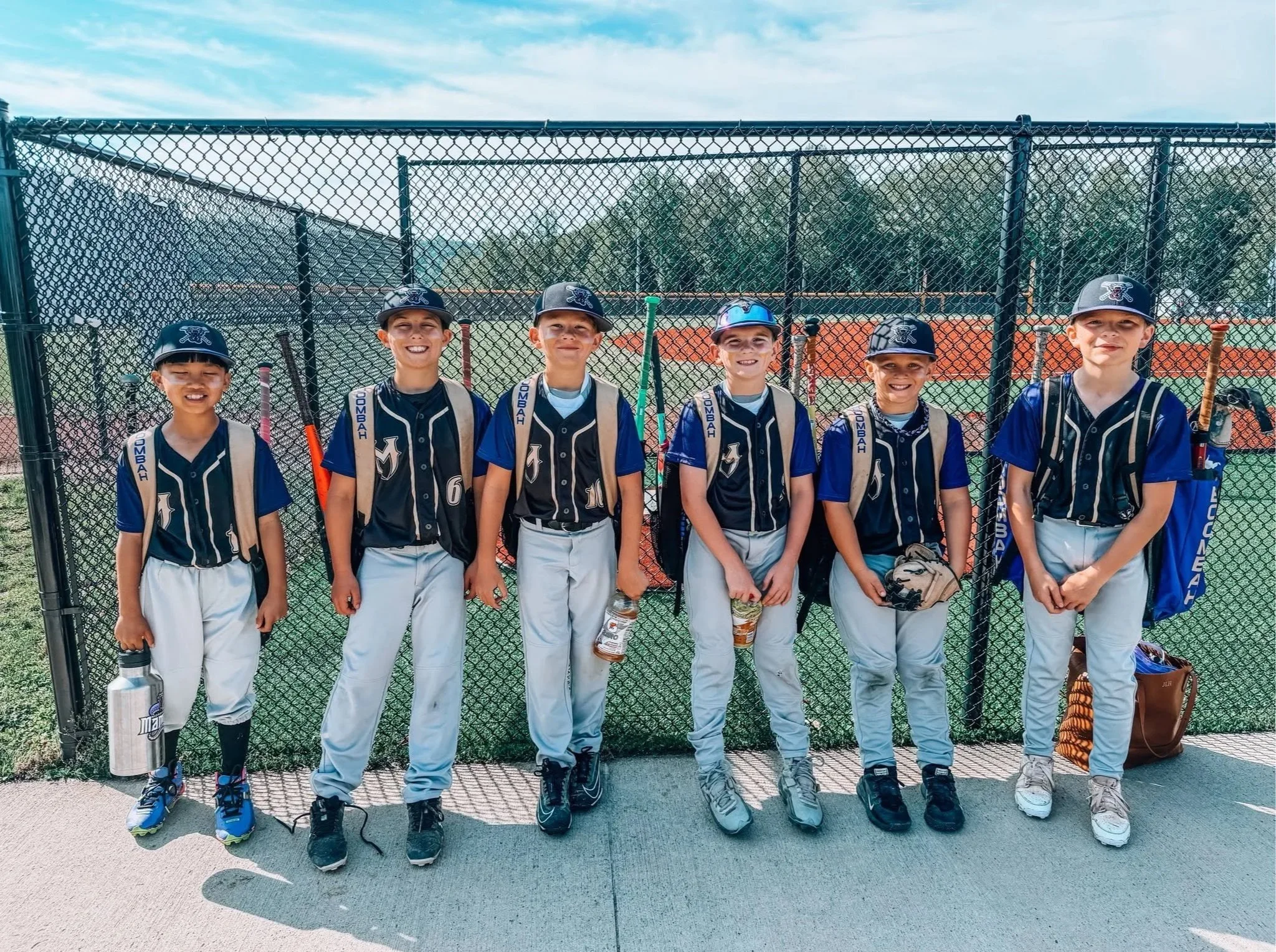
MORGANTOWN MAMBASThe Morgantown Mambas needed a complete team identity before the season started, so there wasn't time to overthink every decision (which, if I'm being honest, is probably good for me anyway). We had to move quickly while still ending up with something that felt custom and built to last.
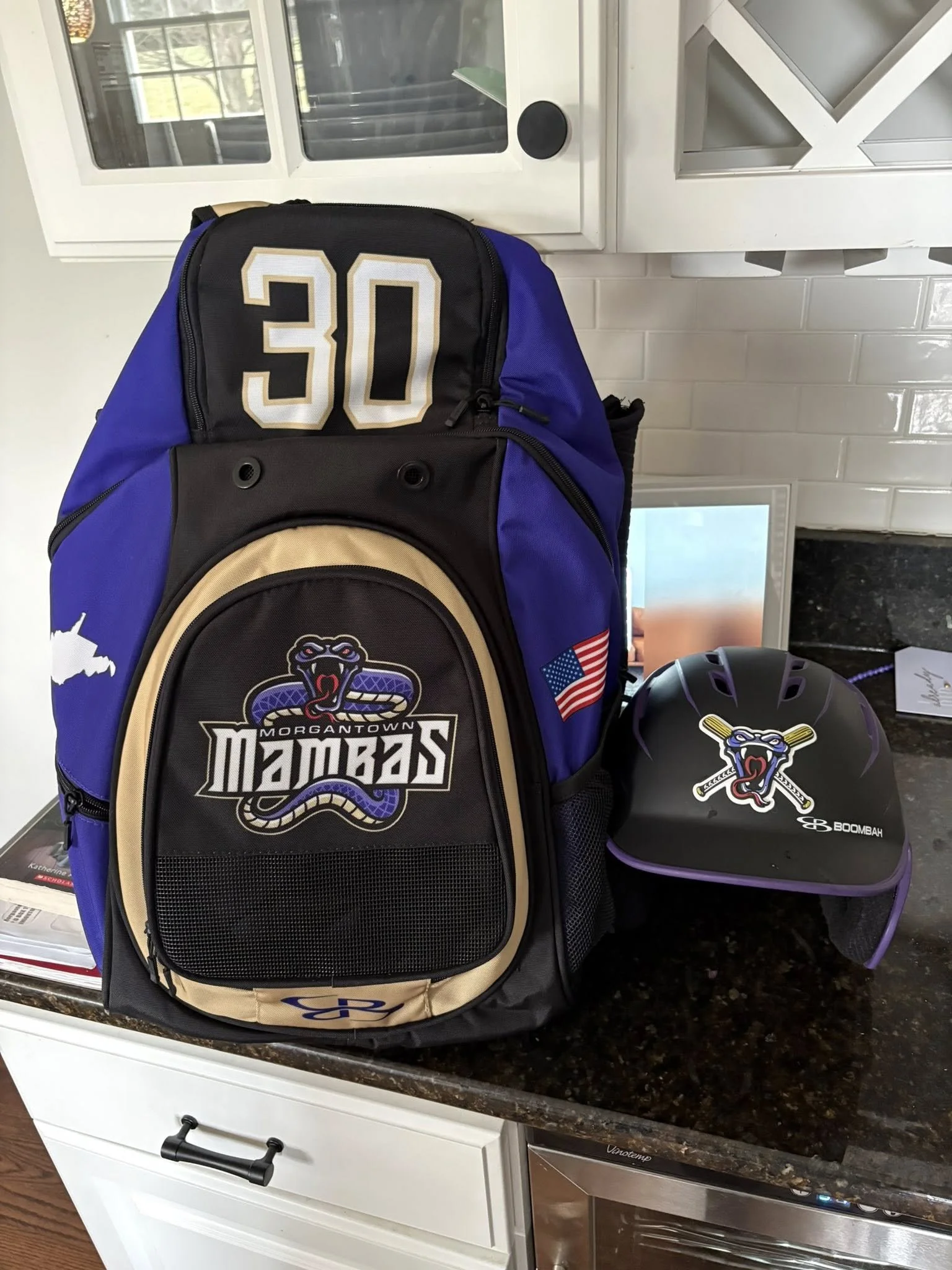
One thing I'll always be transparent about is my process. I didn't draw the snake from scratch. I sourced an illustration that pointed us in the right direction, then got to work making it our own. After some adjusting, simplifying the details, re-coloring, cleaning up the line work, and last little tweaks, it finally felt like the Mambas instead of just another snake graphic.
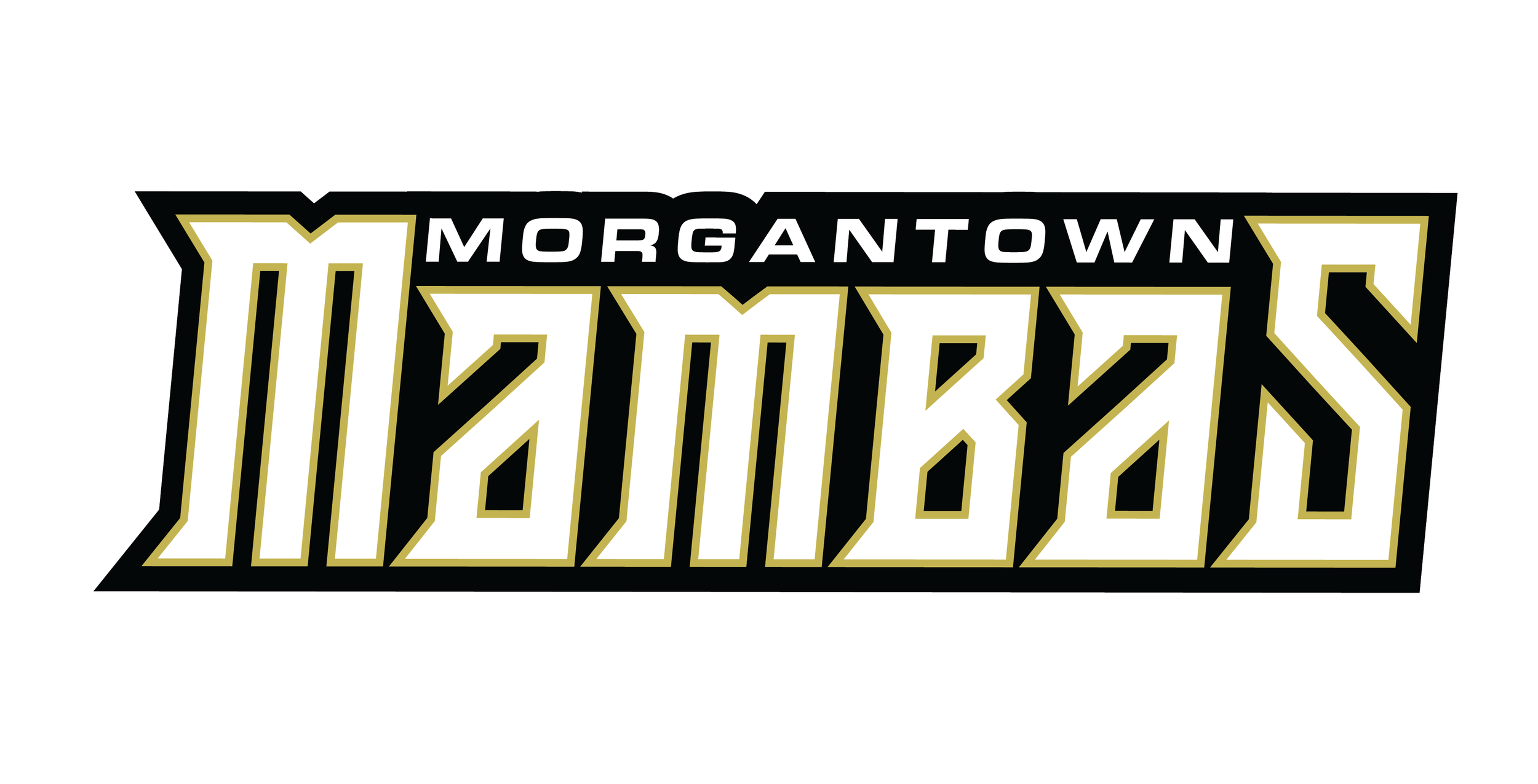
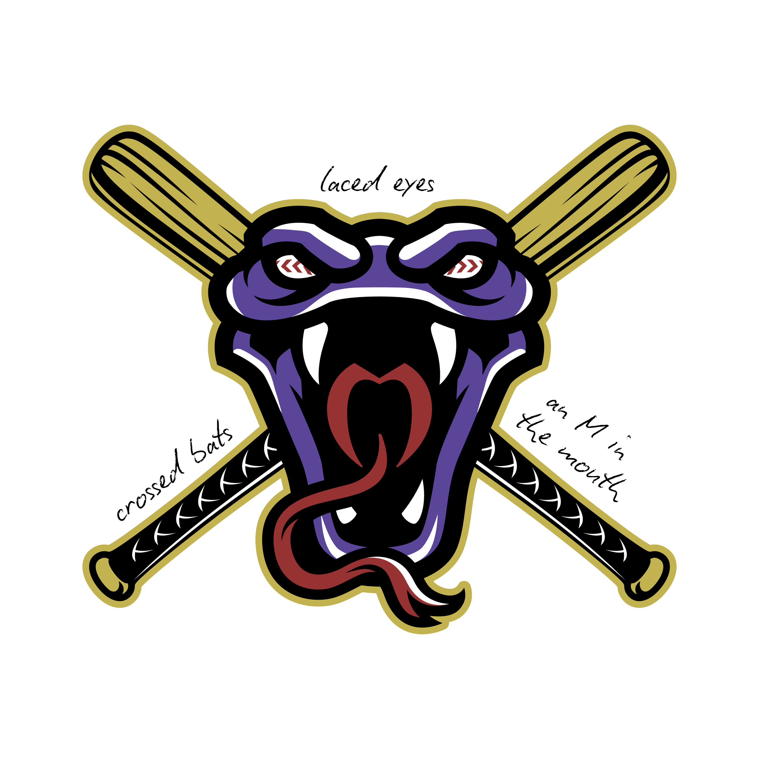
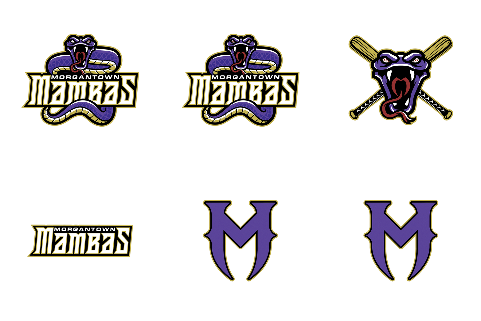
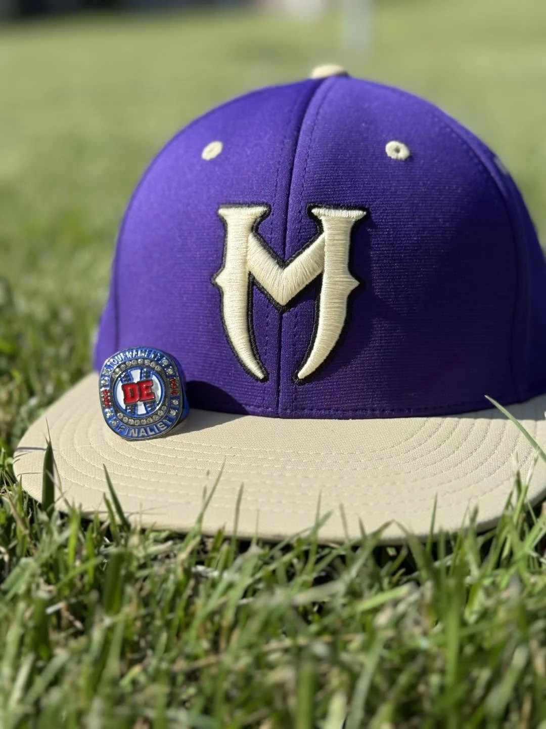
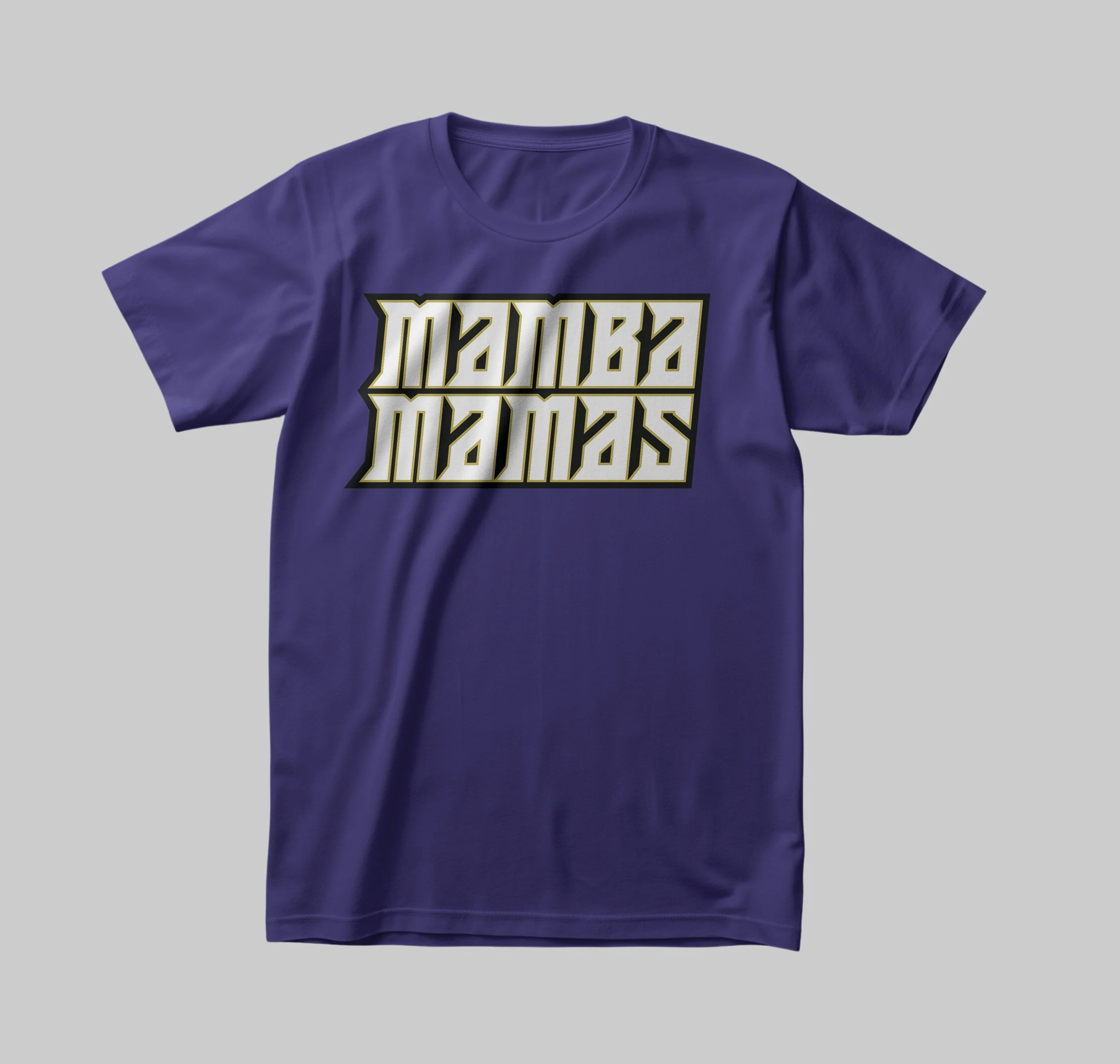
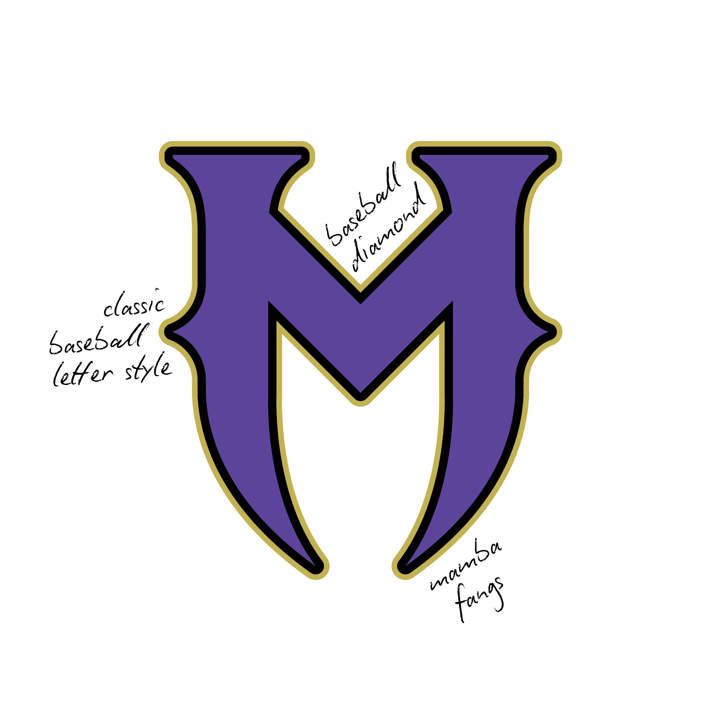
The typography is where the project really became its own. The word mark was custom built to work with the mascot, giving the team an identity that felt unique instead of something assembled from existing parts.
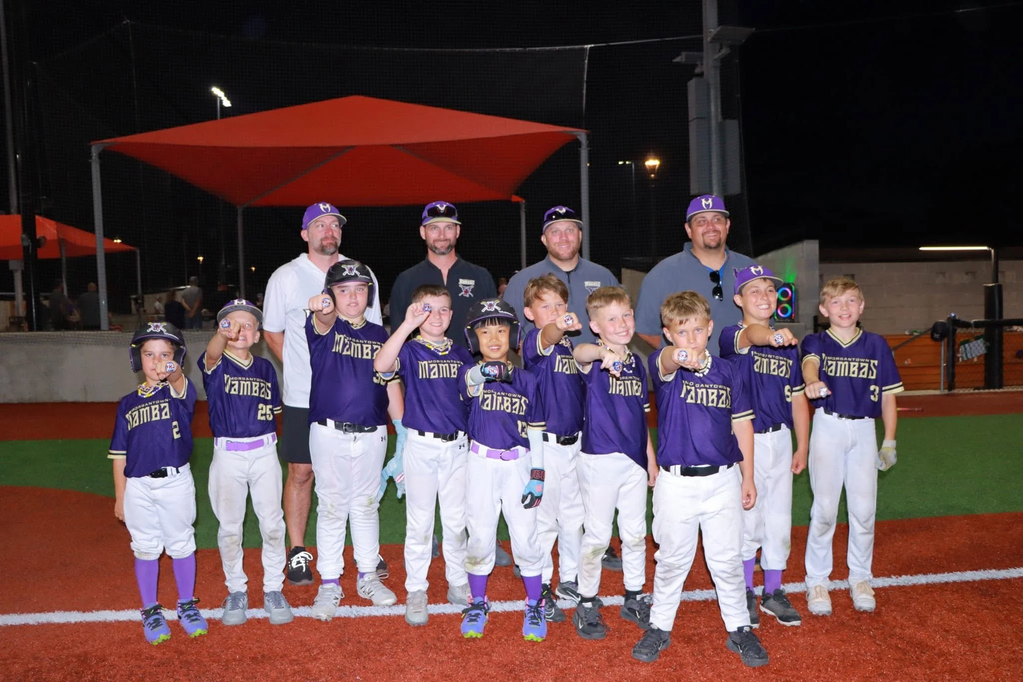
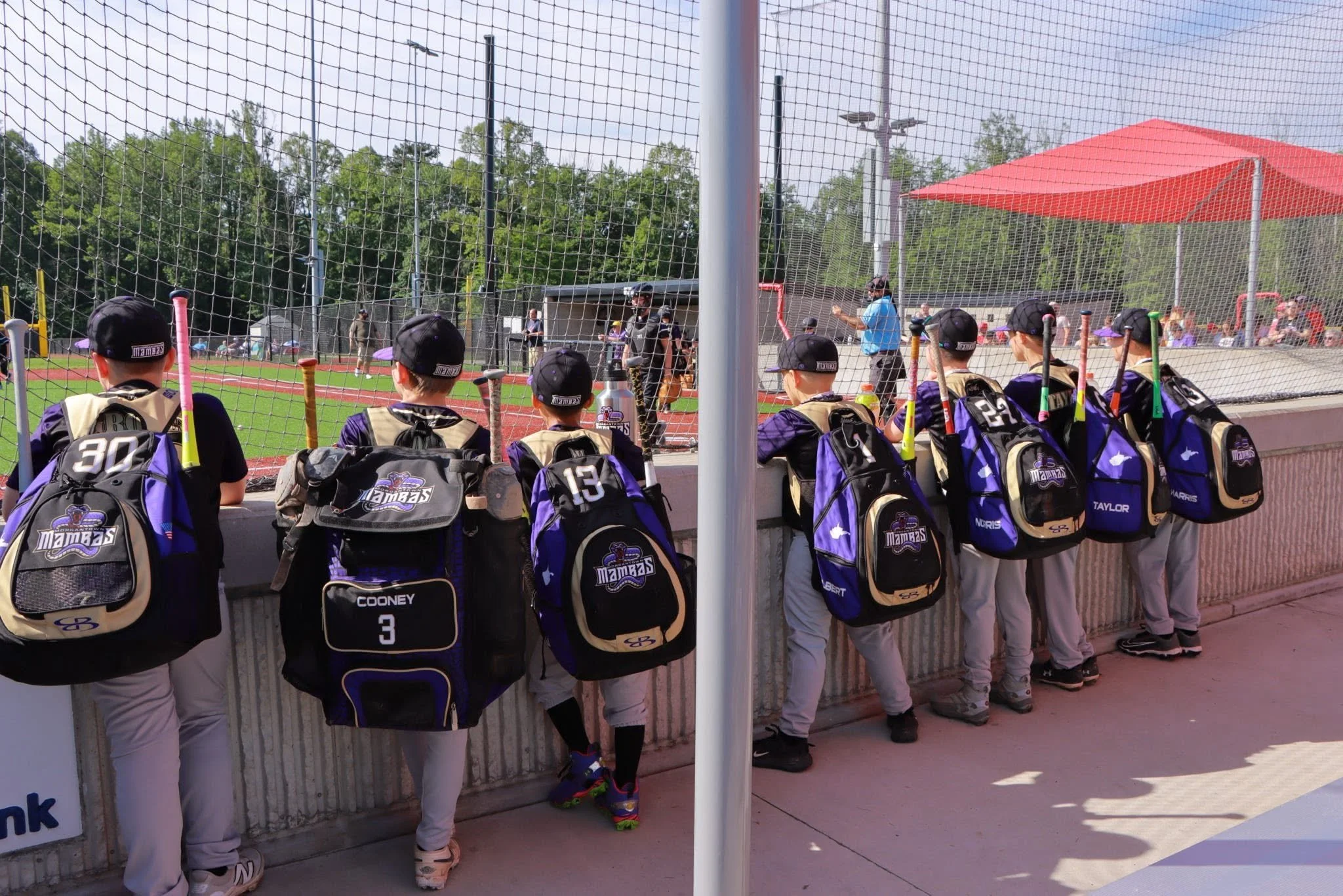
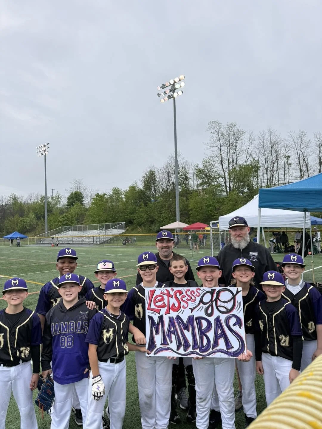
Two weeks after that first conversation, the Mambas had a brand that was ready for jerseys, hats, social media, tournament banners, and all the other places a baseball team shows up throughout a season.
I love projects like this because they remind me that meaningful work isn't reserved for massive organizations with big budgets. Sometimes it's a group of kids putting on a jersey and feeling like they belong.
If a logo can give them a little more confidence walking onto the field, a little more pride in being part of the team, or create memories they still smile about years from now, then that's a project I'll happily pour myself into every time.

TEAM BRANDING
•
LOGO DESIGN
•
CUSTOM TYPOGRAPHY
•
BRAND IDENTITY SYSTEM
•
COLOR PALETTE DEVELOPMENT
•
TEAM BRANDING • LOGO DESIGN • CUSTOM TYPOGRAPHY • BRAND IDENTITY SYSTEM • COLOR PALETTE DEVELOPMENT •