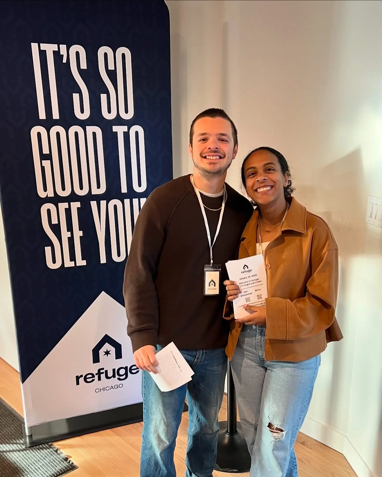

REFUGE CHICAGOBRAND IDENTITY
•
LOGO DESIGN
•
COLOR PALETTE DEVELOPMENT
•
TYPOGRAPHY
•
BRAND GUIDELINES
•
BRAND IDENTITY • LOGO DESIGN • COLOR PALETTE DEVELOPMENT • TYPOGRAPHY • BRAND GUIDELINES •
Planting a new church is one thing. Planting a new church in one of the most diverse cities in America is something entirely different.
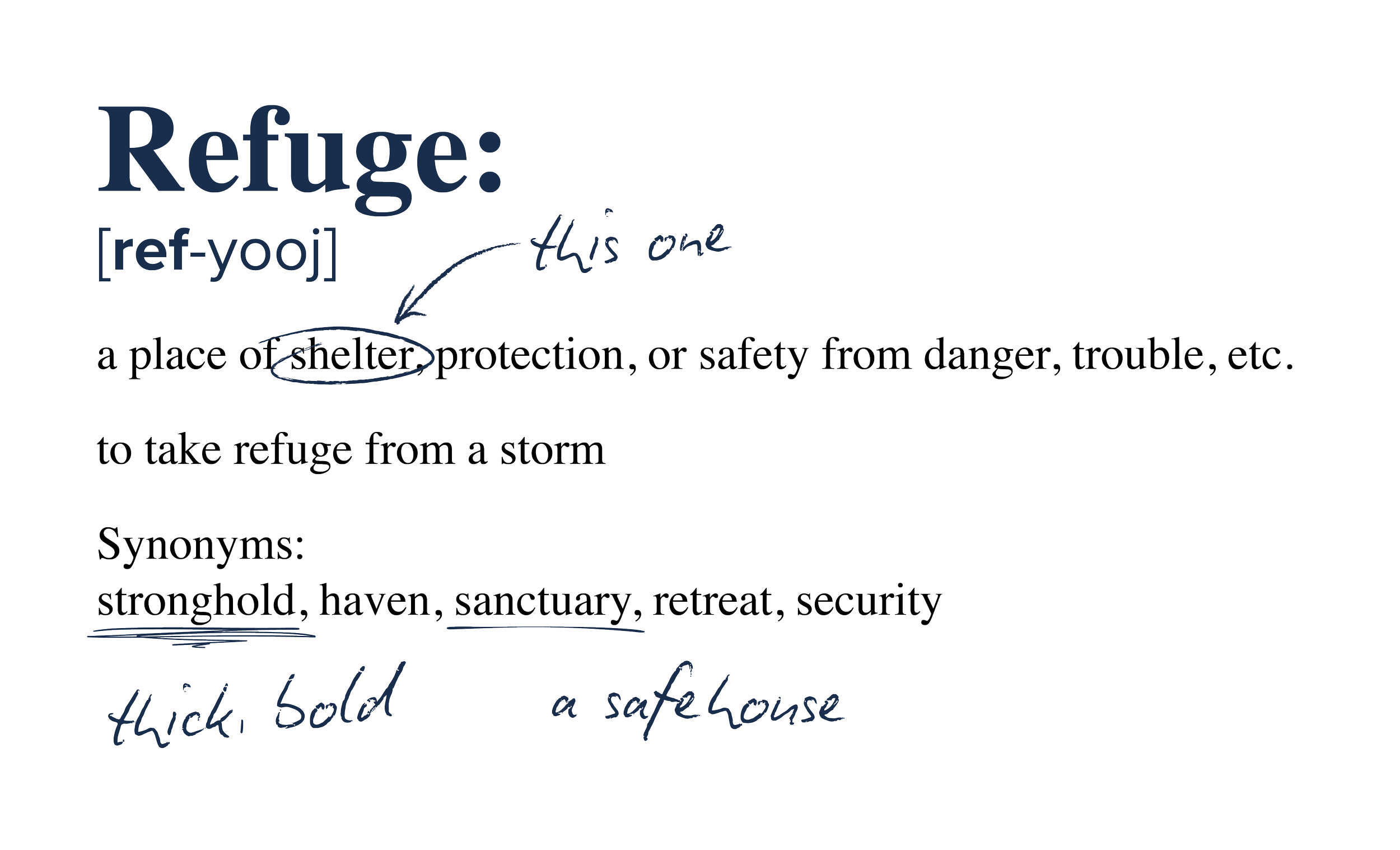
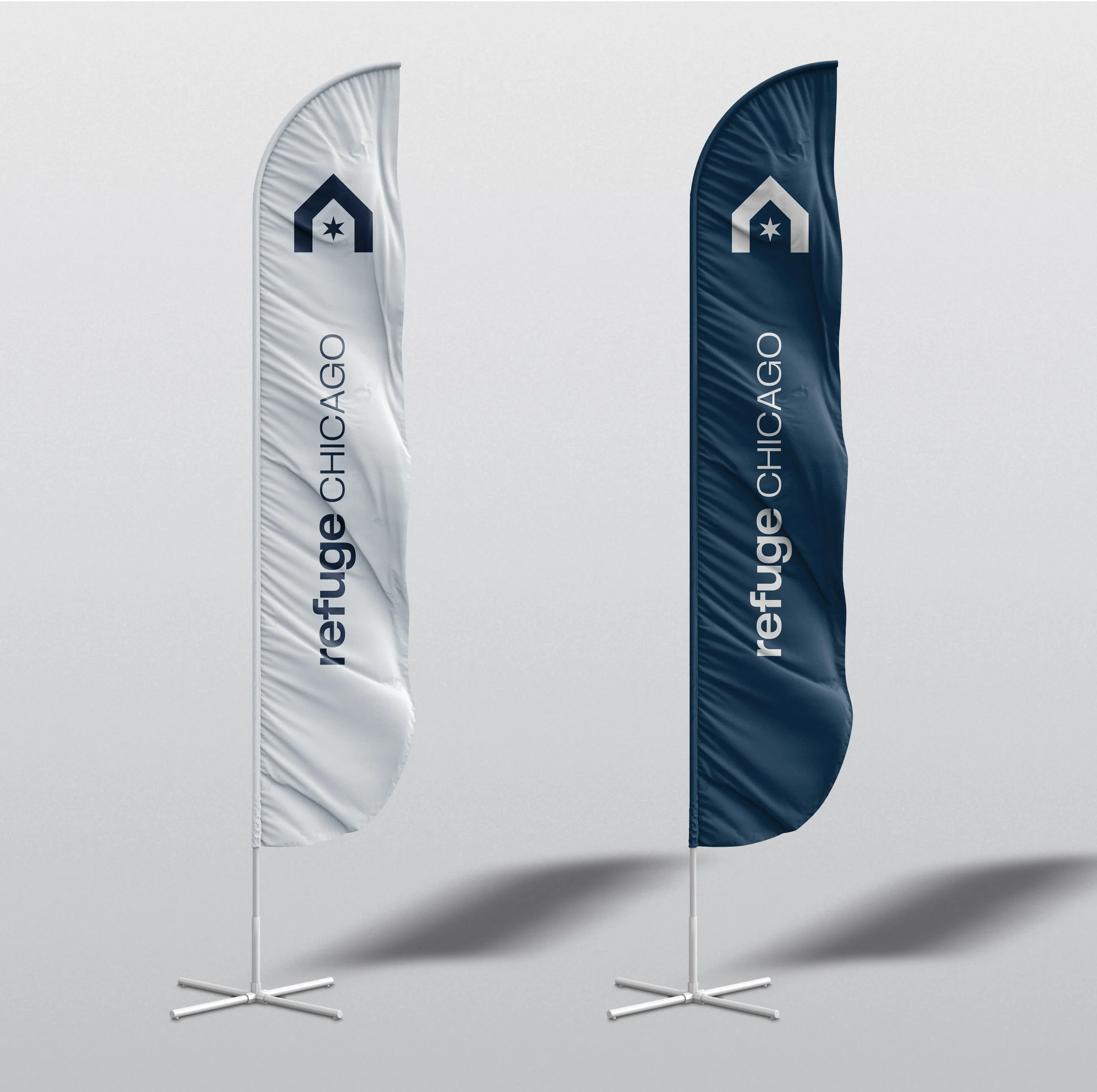
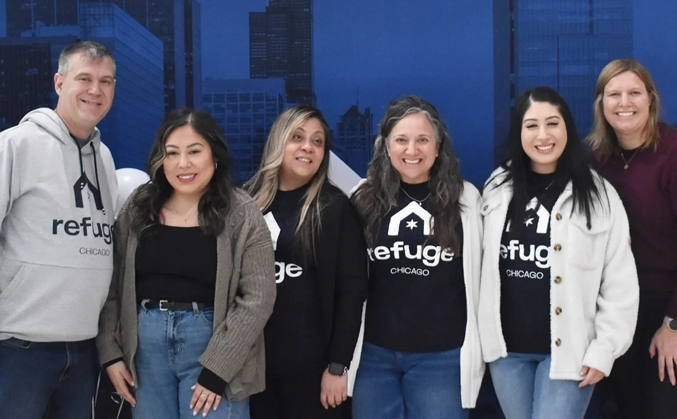
Refuge Chicago was sent my way because they had a clear mission, but needed help to communicate it visually. I was quick to understand that this project wasn’t going to be about heavy complexities or leaving anything open to interpretation. Their vision was much more direct and meaningful than that. They wanted to build a church where people from different backgrounds, experiences, and cultures could gather around a shared love for Jesus and become people of love for the sake of others. That vision shaped the creative process. (literally)
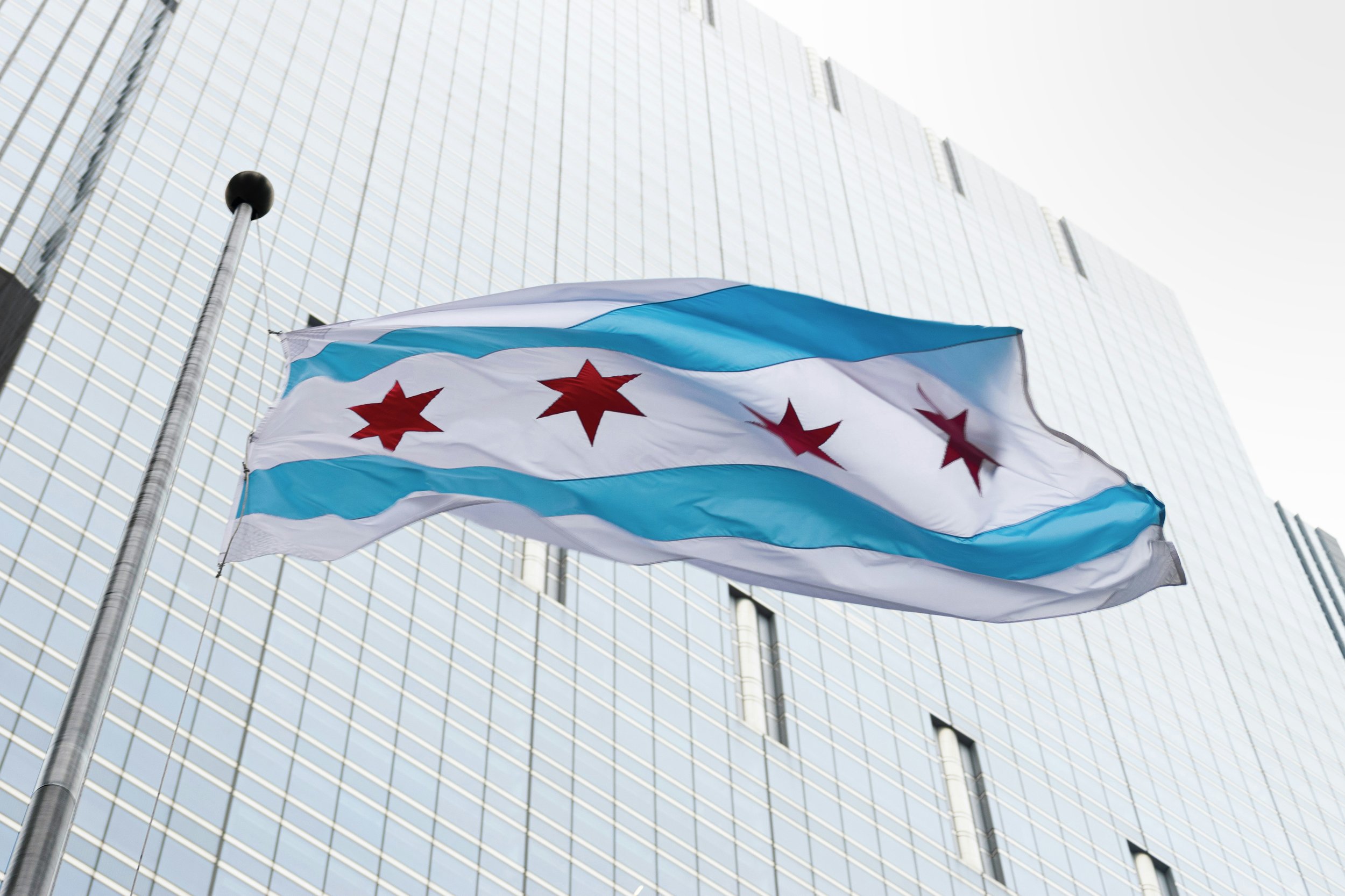
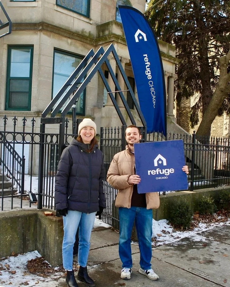
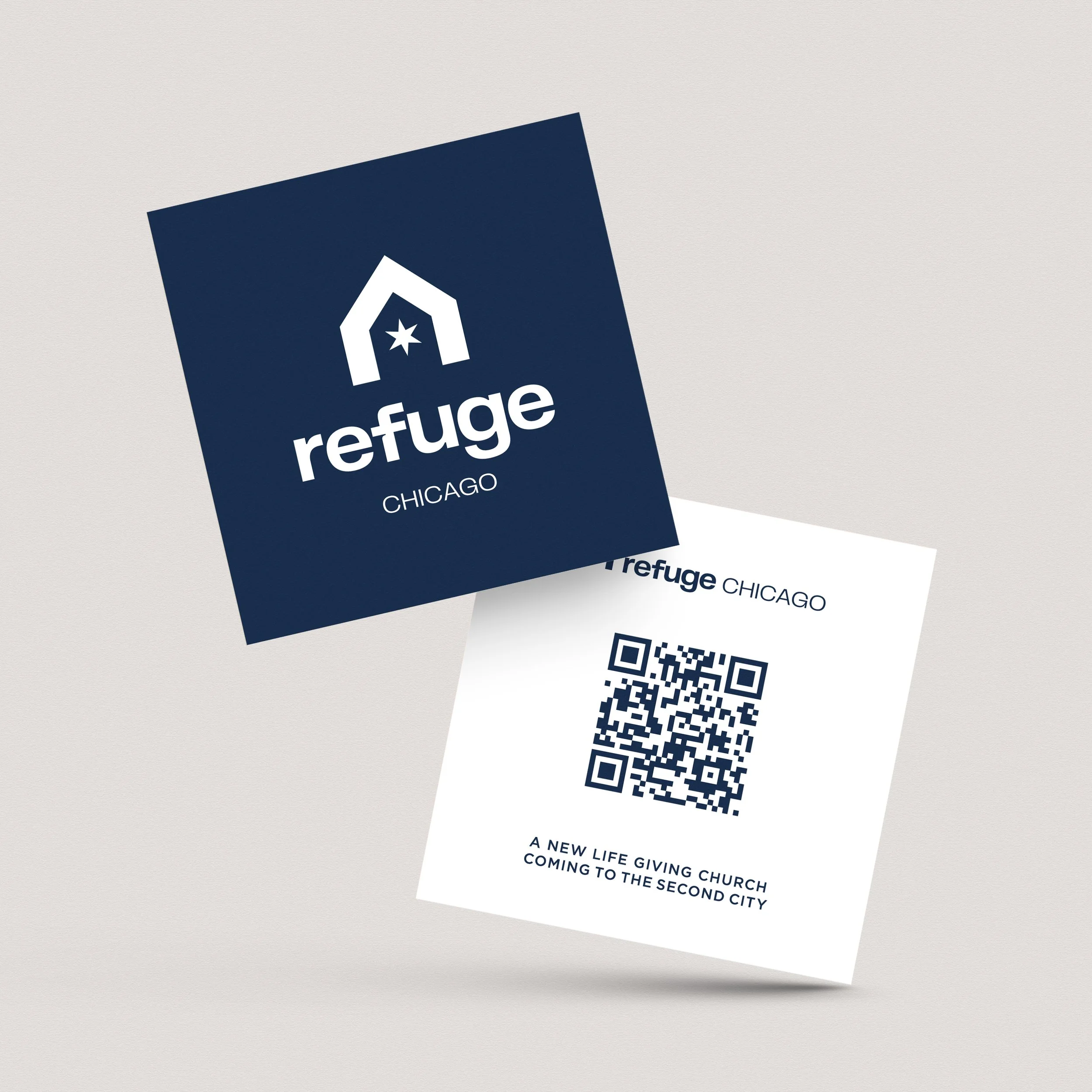
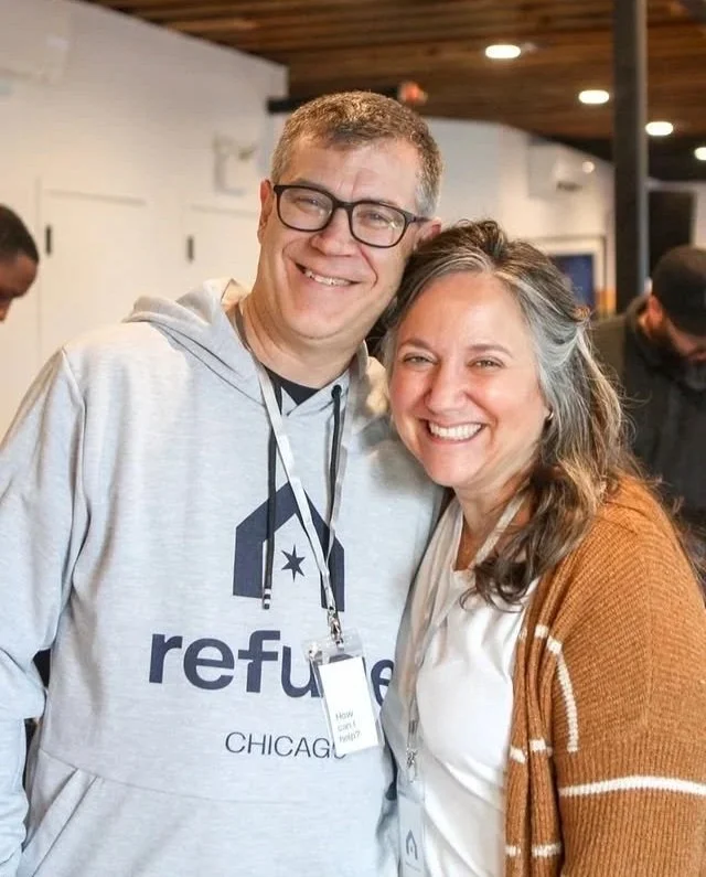
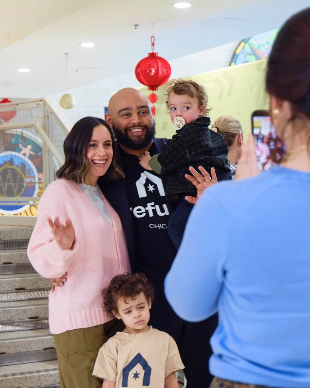
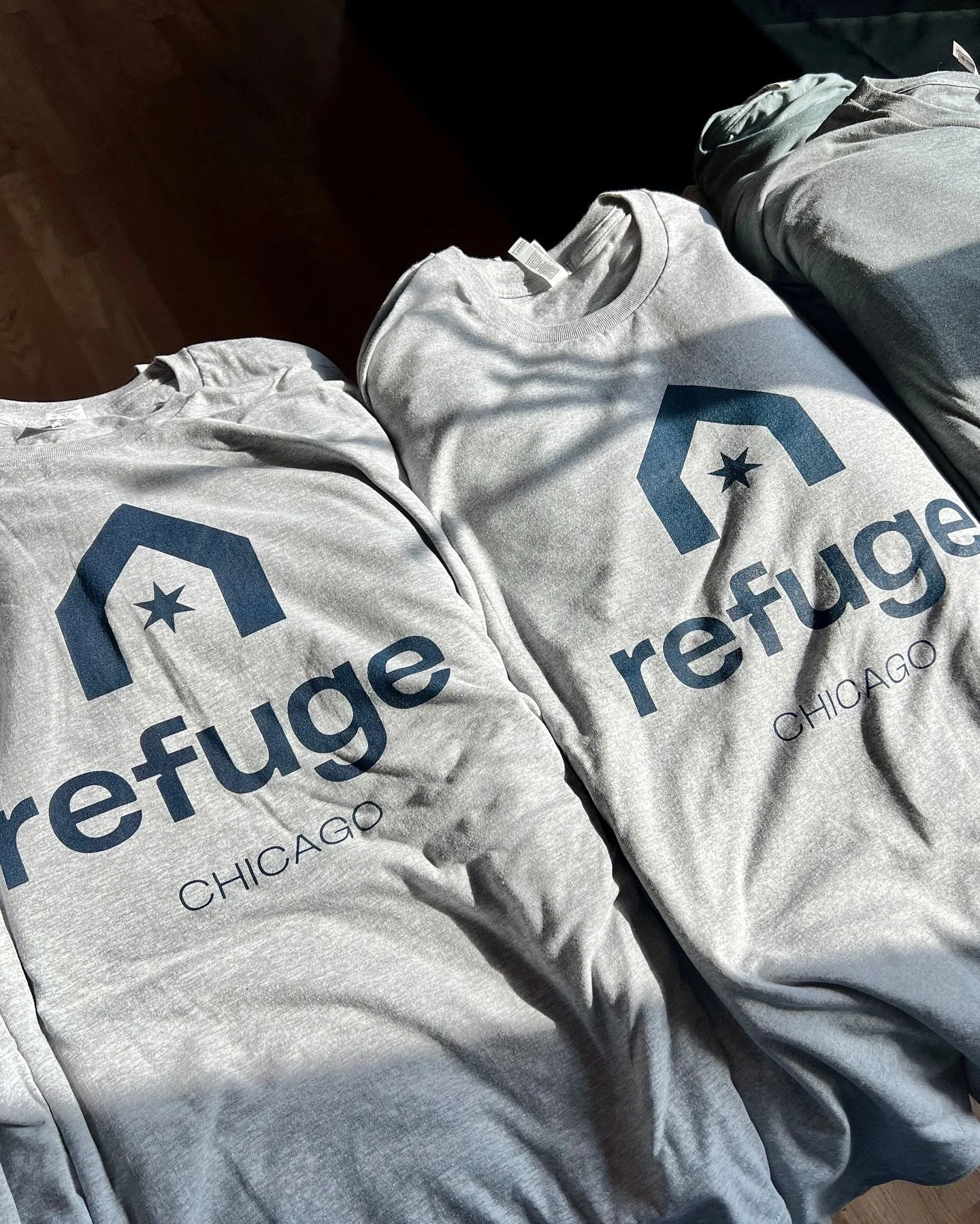
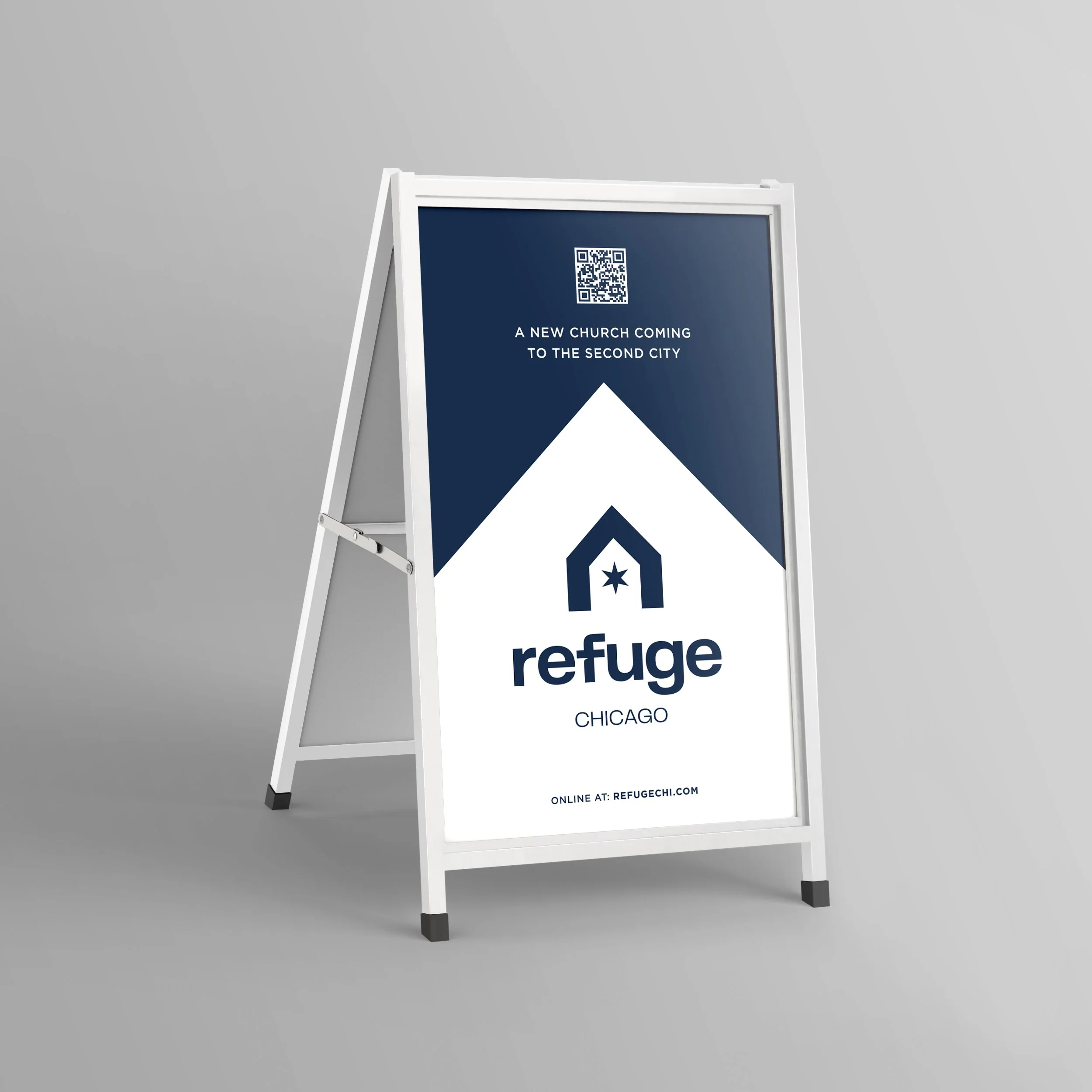
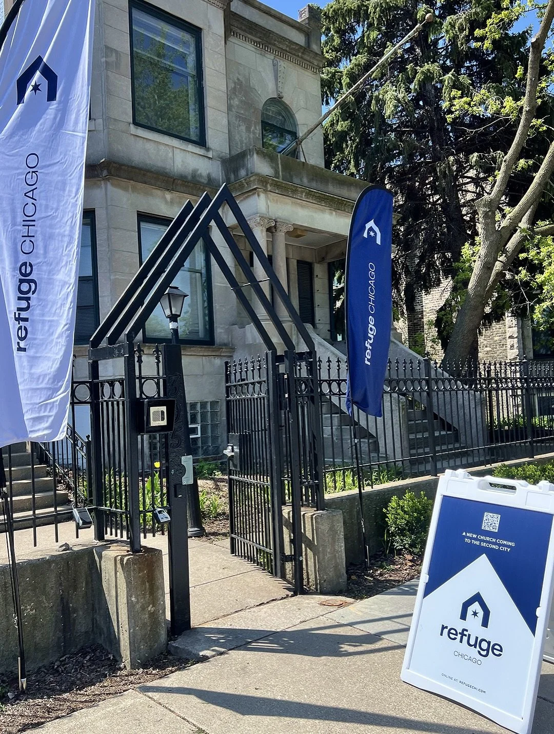
Throughout the project, I explored how the visual identity could reflect the heart of the church: a place of refuge where people could find community, healing, friendship, and hope in the Windy City. The identity was built to represent real refuge for Chicago in its simplest form while giving the church a consistent visual presence across everything from Sunday gatherings to community outreach.
If I'm doing my job well, the logo almost becomes secondary. My hope is that someone sees this church, walks through the doors, and finds exactly what the brand promises they'll find on the other side.